Dear Friends, Colleagues & Customers:
I am a big sucker for Data Visualizations (DV). We all have dabbled with graphs/ charts in our school and at work and they are of course one form of DV. But modern software and techniques now enable to do lot more than plotting a simple bar graph to tell your story. Here I want to present some really cool and powerful data visualizations. They say 'a picture is worth a 1000 words'; I can say, a 1000 words can't really convey the message as effectively as some of these data visualizations do. Some of there are from mortgage / real estate industry, others are not. But they all tell a powerful story.
We also included a link to some Data Visualisation resources (cheat sheets, books, software) down below. Don't miss it.

Evictions are returning, and more than six million households are behind on rent.

In 83 Million Eviction Records, a Sweeping and Intimate New Look at Housing in America — www.nytimes.com
A Princeton sociologist chronicled the human toll of eviction in one city in a 2016 book. A new project may reveal just how widespread the problem is.

Melbourne, being one of the most liveable cities in the world, has attracted a lot of individuals across the globe. Many of them dream of making this beautiful place as their home. My journey in the…

Estimating how many residents left New York City, neighborhood by neighborhood.

Data made visual with charts, tables, maps, and other graphic elements. They are often interactive and contain text for labeling, not narration.

Redlining helped reshape the urban landscape of U.S. cities. It also left communities of color far more vulnerable to rising heat.

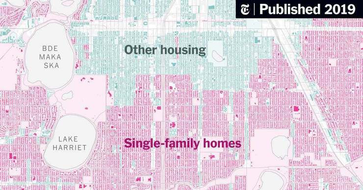
Rising concerns about housing affordability, racial inequality and climate change are causing cities nationwide to re-examine their attachment to the detached house.

New government rules will require all cities and towns receiving federal housing funds to assess patterns of segregation.

The disappearance of thousands of flights from China’s skies in recent weeks points to how the coronavirus has hobbled a nation and is posing a threat to the global economy.

The virus has infected and killed millions of people around the world. See detailed maps and charts for each country.

The people in this story may look familiar, like ones you’ve seen on Facebook or Twitter or Tinder. But they don’t exist. They were born from the mind of a computer, and the technology behind them is improving at a startling pace.

An interactive map lets readers explore the 2016 election in new detail.

Family life looks very different across the country, depending when women first give birth.
Corpus of 32 DV cheat sheets, 32 DV charts and 7 recommended DV books
